

PALERMO CITY BRANDING
My final thesis senior project had to be a culmination of all my knowledge throughout my entire time at Tyler School of Art and Architecture. I decided to try my hand at city branding, a project I’ve wanted to take on ever since I’ve seen the countless outstanding city branding projects online.
Includes
Brand design
Wayfinding Design
UI/UX
Applied Graphics
Marketing
Print Design
Software
Adobe Illustrator
Adobe Photoshop
Adobe Lightroom
Awards
Click here to view
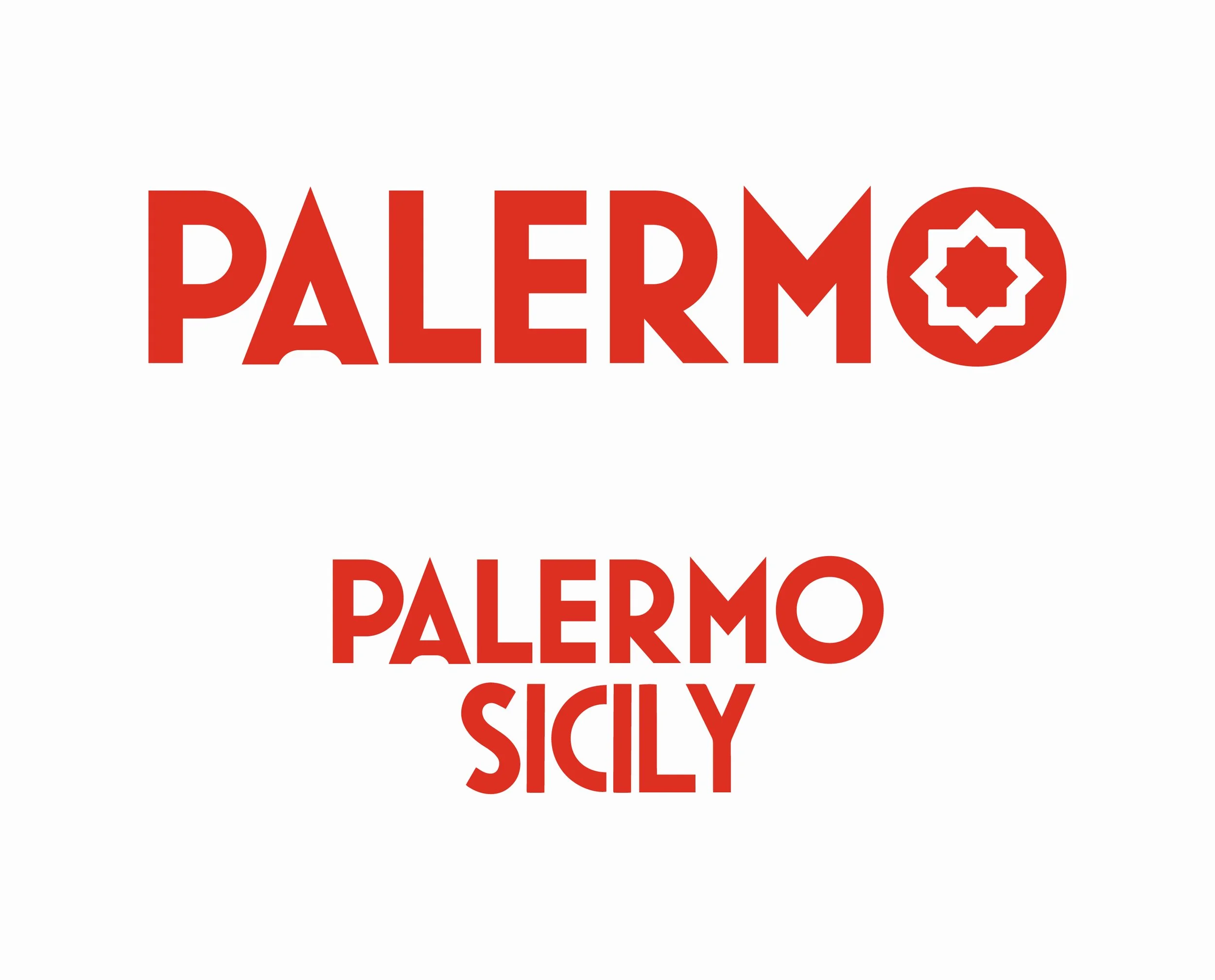
Like most projects, this too began with the logo design.
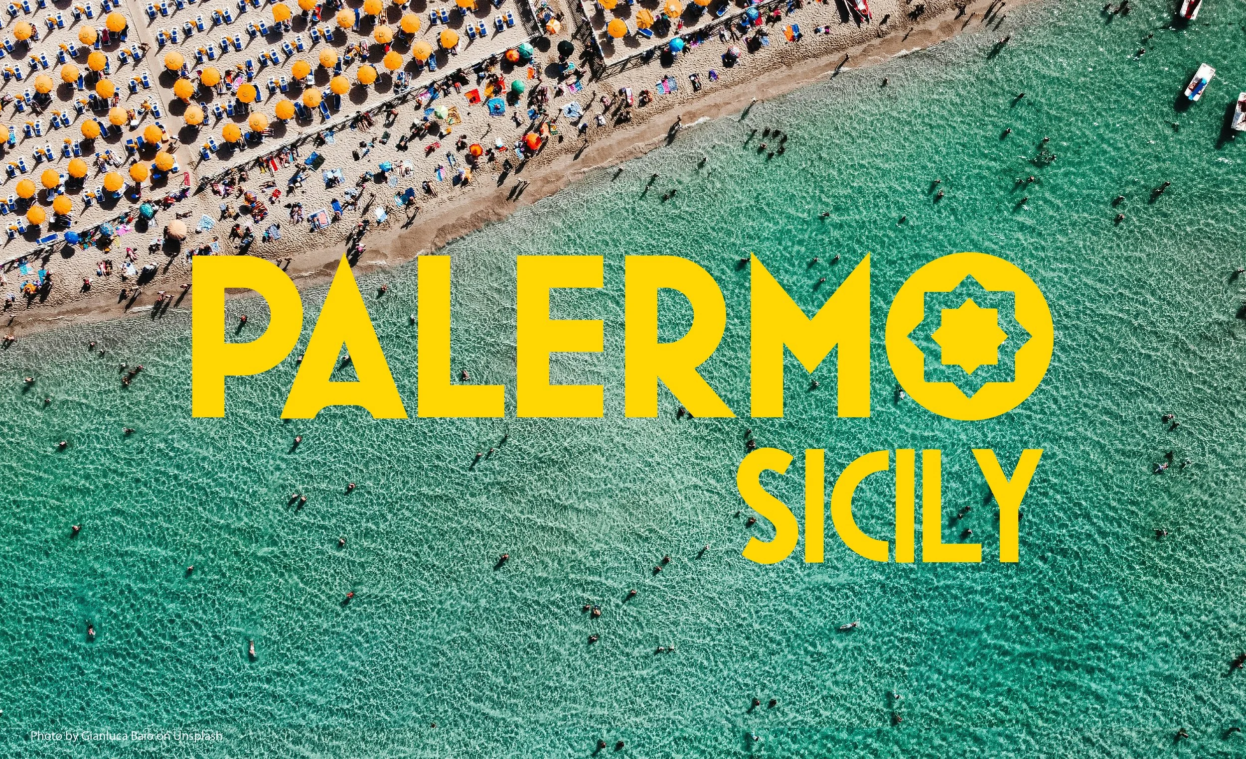
The logo itself uses a modified version of the typeface Mostra Nuova. It’s main brand element is a sun shaped, 8-pointed star found in the counter of the letter O. The brand mainly uses a purposefully bright red and yellow, a callback to both the flag of Sicily and Palermo’s Coat of Arms.
A submark logo without the star is included in the brand as well for alternate use. I wanted to keep the logo simple, yet meaningful, because of the many different applications of the logo varying from small to large.
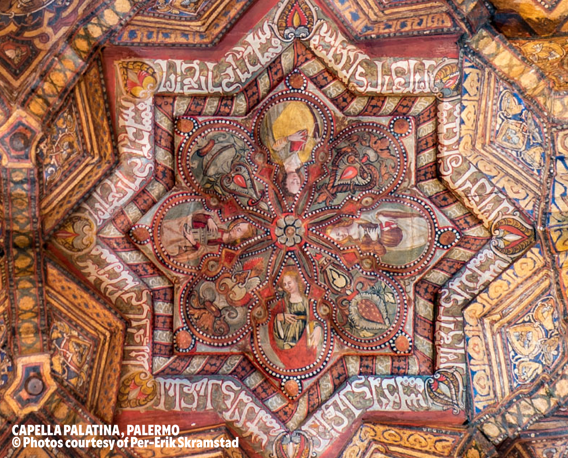
Creating design with history.
With access to so much life and history behind the City of Palermo there was a lot to pull from. Creating an overarching logo for a single city is a challenge as a city can have so many different personal meanings for many different people.
I decided to pull my concept from muqarnas which are found in traditional Islamic and Persian architecture. They are a style of decorative ceiling ornamentation and are quite geometric, with a lot of repeating shapes and patterns. The only remaining muqarnas in Italy are located in Palermo, so it felt fitting to add it.
I wanted to especially make a reference to the Arab Dynasty as they were the first to declare Palermo a capital during their time in power, and because their influence on the city’s architecture and cultural identity is a significant part of its history.
A brand created for both tourists and residents.
An import part of this project to me was to be aware of the damages of over-tourism. In many European countries, there have been problems with over-tourism and Palermo is no different.
During my research, I came across a statistic from the Italian Institute of Statistics: roughly one-third of Italians are at danger of poverty, and in the South, this figure could reach to over half.
It sits as a reminder that no matter where you go, you may view a location as an ideal vacation location, but there are people living there who are facing difficult challenges. In my work, I wanted to handle this with consideration and respect.
The Two brands were Turismo Palermo, as well as Explore Palermo, a child-friendly focused version of Turismo Palermo.
The Turismo Palermo brand itself is aimed at education not just for tourists, but for domestic schools, students, and tourists as well.
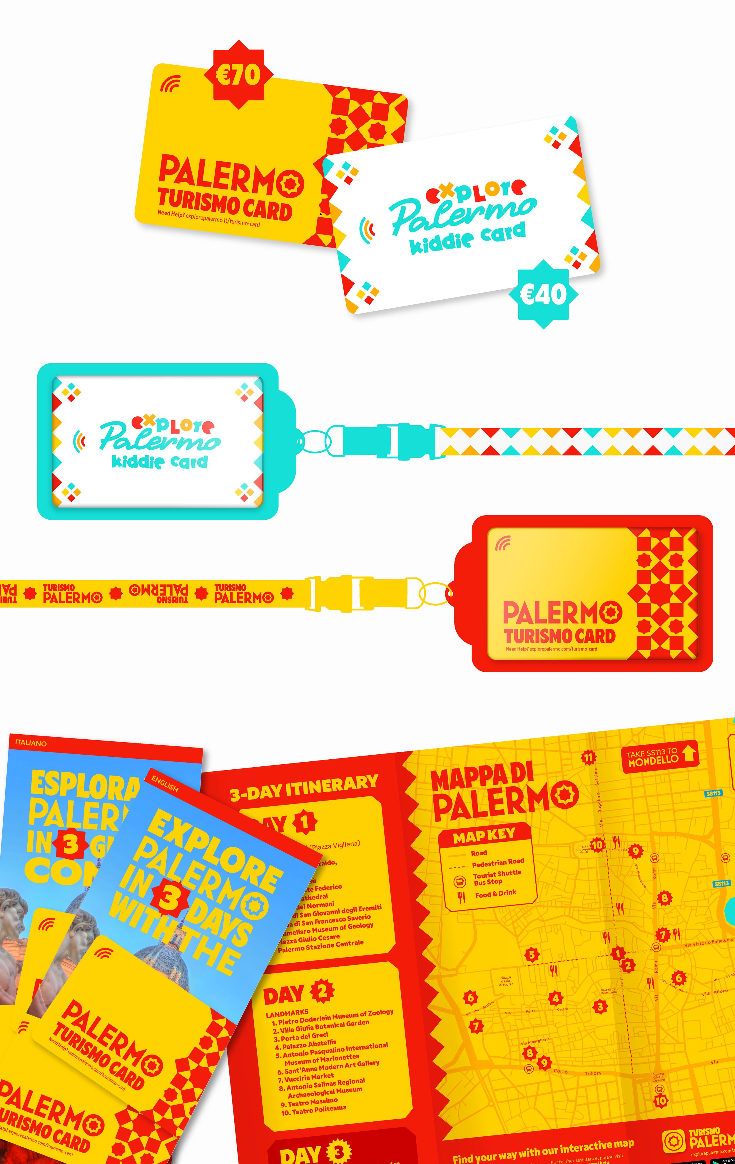
Tourism and TURISMO Cards.
One of the first things I wanted to do for this project was a TURISMO Card. Turismo is just simply the Italian word for Tourism, however the card itself was an idea sparked by my parents. When they had travelled to Italy a few years back for their 30th anniversary, in Firenze they had used the Firenze Card, for a flat rate tourists gain access to a multitude of museums, tourist attractions, and in the case of the Palermo TURISMO Card: transit on the Tourism Shuttle!
This concept was even further solidified as during my research I found that Tourist Italy mentioned that rising traveling costs are lending tourist to seek out more deals, use travel hacks, and avoid peak prices. This TURISMO Card would be for those tourists looking for an easy, inexpensive, and painless way to travel!
I also hypothetically wanted a separate card for schools and children, as I wanted the concept behind that card to donate a portion of its proceeds to local schools around the area, a way to promote giving back to the community.
A travel-focused app needed to be simple and easy for all users.
When creating the UI/UX I wanted to create an app that was quickly and easily accessible. I wanted the card to be one click away from the home screen, as well as the map and transit/tickets.
The app also showcases different locations nearby, and also events that happen during the week. I wanted the app to be something that you could easily navigate what you needed to leave more time for learning, traveling and touring!
The TURISMO Card can also be added to Apple and Samsung Wallet, giving users another way to tap their card when traveling around Palermo.
Transportation was a big concern.
A big issue that is on going in Palermo, alongside many other large cities in Italy, is the already crowded and cramped public transportation. A lot of tourist take public transit as well when visiting, though packing more people into a crowded bus adds more irritation and annoyance for everyone, if you’ve ever been on a crowded bus or subway, you’d understand.
My first immediate idea was to include a tourist shuttle that would cycle through many different tourist destinations in Palermo. These stops are marked on the brochure and would allow for tourists to travel through the city without taking space on the main public transit for those who take it for work or school.
Designer’s notes
I wanted to end my college career with a bang, and as I briefly mentioned before, I was always attracted to the idea of city branding. I knew it was such a large-scale project that had so many different pieces to it that it felt perfect for a senior project. I was really inspired by many different city branding projects out there, including the fantastic Helsinki brand, the ever so iconic Melbourne brand, and the beautiful City of Porto brand. Now all these projects had a whole team of people working on them for months on end, and as a solo college design student, I am proud of the amount of work I was able to get out with my limited resources and within 15-week course. I was able to create a brand that I felt really represented the city in a creative way.
I also have a very personal connection to the city of Palermo. As many of you may not know, I am an Italian Citizen (though born in America) and I have family on my mom’s side of my family that reside in Caccamo, a smaller city located in the Metropolitan area of Palermo. I visited Palermo back in 2015 with my family and had an amazing time. As someone who loves history and world cultures this city was one of my favorites. We stayed not too far from Palermo in Mondello, a borough of Palermo located north of Mount Pellegrino. Having experienced the city for myself, I felt I had a clearer idea of what I wanted specifically for this brand, rather than if I had never visited the city.
I really learned a lot in my last semester and I had finally put a bunch of different techniques and skills that I’ve learned throughout the years into this project. I found myself referring back to my older projects with certain mockups or editing techniques and I really got a good grasp and understanding of how my skills have developed over the years. I’m also proud to share that I have avoided AI image generation completely in this project. I have used Chat GPT in two instances for copywriting on the wayfinding totem, aside from that everything is authentically human!
Read the full story here on Medium: Palermo Case Study by Christian van der Kleut
Awards
I get the honor to share that my project, Palermo City Branding, received an award in the Branding Category at Tyler School of Art & Architecture.
Instructor
Mia Culbertson
(Tyler School of Art & Architecture / Temple University)
Cover Photo
Photo by Gianluca Baio